Camptoo
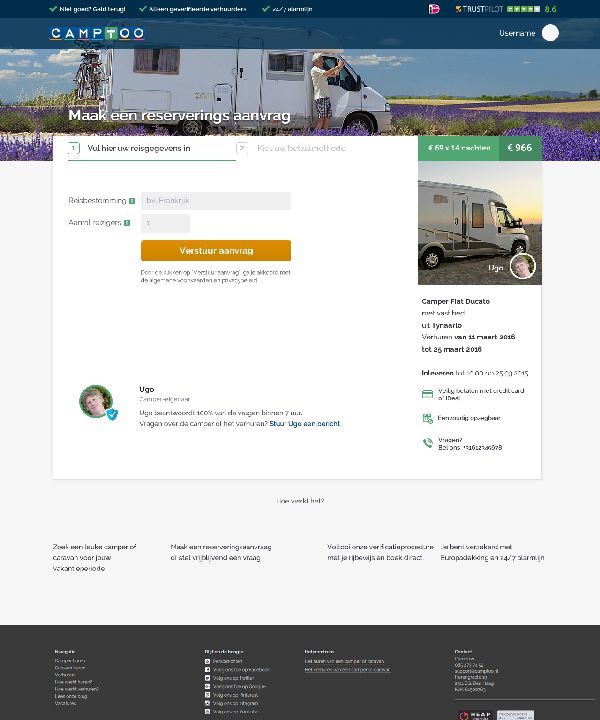
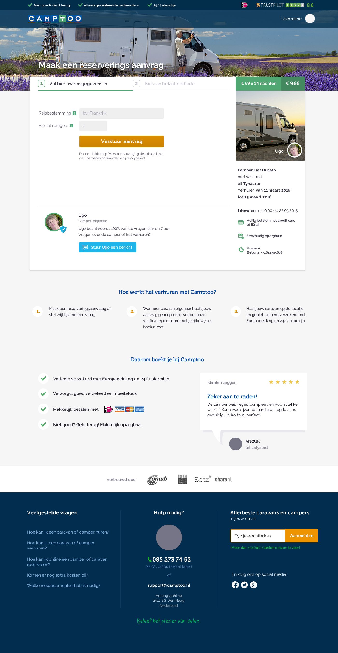
Problem1: lack of reassurance and long flow to get to the end goal (signup, rent caravan / place your booking)
Solution1: add reassurance, extra messaging options to connect both sides, explanation of the process (test extra blocks and use elimination strategy with AB testing, figuring out which one makes a difference)
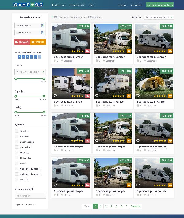
Problem2: results page is messy, hard to browse, unfocused. The goal was to improve scanability and readability.
Solution2: cleaup of results page, set clear definition between functionalities (easy to filter, browse, see different options: caravans and campers).
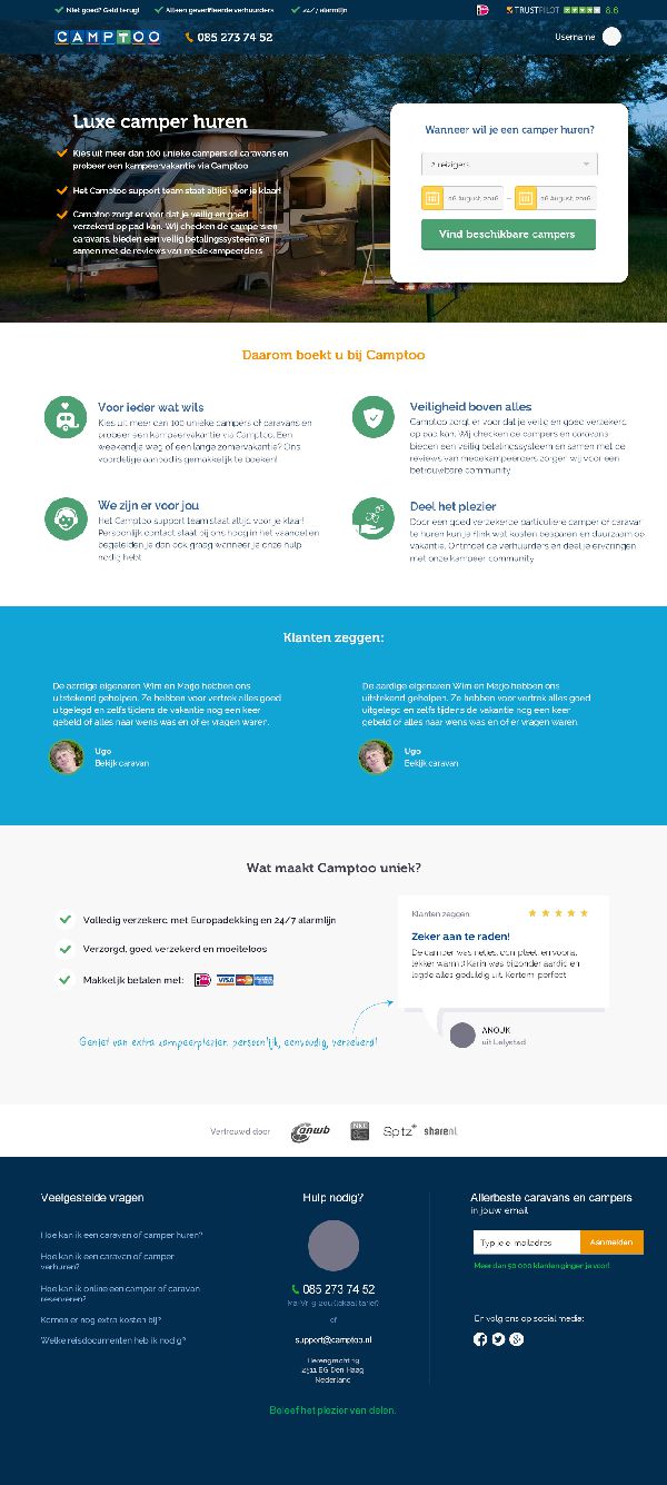
Problem3: increase conversion rate in general, but target groups are different and require different messaging and reassurance.
Solution3: landing page structures to test value proposition per different target groups, tailored to customer (based on customer feedback).
My work: UI/UX, cleanup of visual design (together with studio Migle), customer interviews to identify what works for which target group and which visual language should be used (some customer segments were 65+).
